
First steps
BX Corp faced a challenge: its previous visual identity felt outdated and lacked viability in today’s competitive landscape. The brand needed a refresh that would convey innovation, professionalism, and a distinct personality aligned with its technological vision.
Creative thinking
to generate an idea that works for digital workspaces
BX Corp faced a challenge: its previous visual identity felt outdated and lacked viability in today’s competitive landscape. The brand needed a refresh that would convey innovation, professionalism, and a distinct personality aligned with its technological vision.
Logo Design Concept
The logo integrates three elements that represent the essence of BX .
The first is the Wi-Fi symbol, a clear sign of our connection to technology and our ability to provide remote, accessible, and efficient solutions.
The second is the bee, our mascot symbolizing collaboration, structure, and collective purpose.
Finally, the organic shapes inspired by honey evoke the care, dedication, and attention to detail we bring to every project. In this way, our logo communicates who we are: a company where technology and human experience work in harmony.
The grid ensures balance and consistency in the construction of the logo, aligning each shape precisely to maintain a strong visual identity.


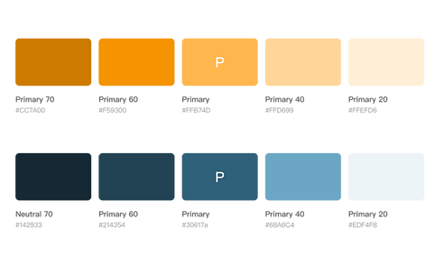
Color selection
Blue and yellow form a strong and balanced color combination for BX Corp, with each representing a key aspect of the brand’s identity. Blue serves as the primary color, chosen to evoke feelings of trust, stability, and professionalism. Yellow is used as an accent color to bring vibrant energy and a touch of innovation.
