First steps
Ectarea needed to differentiate its physical space from the private areas within the environmentally protected zone managed by Ectágono and Ríos Tarango. Ectarea is a tangible hub where various sustainable projects grow and accelerate their operations, while also serving as a headquarters for Ectágono and Ríos Tarango.
The branding approach required creating a distinct identity for Ectarea that would set it apart as a unique physical and operational space, yet still maintain visual and conceptual connections to the overarching identity of Ectágono. This meant identifying shared design elements—such as color palettes, typography, or iconography—that could subtly link Ectarea to its parent organizations while establishing its own presence and recognition.
Creative thinking
-
Understanding the Space and Its Purpose: Conducted research on how Ectarea functions as both a physical hub and a collaborative ecosystem for sustainable projects.
-
Identifying Core Values: Highlighted sustainability, innovation, and community support as central values to communicate through the brand.
-
Mapping Relationships: Defined how Ectarea’s identity should relate to Ectágono and Ríos Tarango without losing its individuality.
-
Visual Exploration: Began experimenting with visual elements (colors, shapes, typography) that could differentiate Ectarea while keeping a subtle connection to the parent brand identity.
 |  |  |
|---|---|---|
 |  |  |
Making Ectarea´s Logo

The logo integrates three elements that represent the essence of BX .
The first is the Wi-Fi symbol, a clear sign of our connection to technology and our ability to provide remote, accessible, and efficient solutions.
The second is the bee, our mascot symbolizing collaboration, structure, and collective purpose.
Finally, the organic shapes inspired by honey evoke the care, dedication, and attention to detail we bring to every project. In this way, our logo communicates who we are: a company where technology and human experience work in harmony.
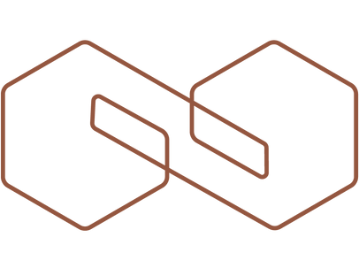
The logo is composed of different hexagons, creating the different "arms" or extensions that connect the two elements of the logo. It is thus conceived as a simplified 3D structure in lines.


Color selection
The color palette is led by a vibrant green that embodies the spirit of a natural, regenerative space — balanced with contrasting hues that keep the soul of nature alive.
