
First steps
Sofia Seidel is a Mexican chef who is looking to establish her own personal brand. She aims to follow her passion while creating a cohesive visual identity through content that is consistent and thoughtfully curated. Her brand style focuses on muted yet warm colors, designed to evoke a sense of elegance and sophistication, reflecting the care and artistry she puts into each of her dishes. The goal is to create a brand presence that not only highlights her culinary skills but also builds anticipation and appreciation for the refined experiences she offers.
 |  |  |
|---|---|---|
 | 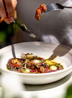 |  |
A delicious visual
The Seidel logo was designed to clearly communicate Sofia’s craft and profession. To achieve this, the fork, knife, and the letter “S” were combined into a single, cohesive icon. This versatile mark can function as a standalone logo or as a seal representing everything Sofia creates. The design was intentionally kept simple so it could be applied as a stamp on food items, such as bread, reinforcing her personal touch.
Since its launch, the Seidel brand has been successfully established and implemented across various touchpoints, including her “Chef’s Nights,” where the fully developed visual identity helps convey the elegance, sophistication, and culinary expertise that define her brand.

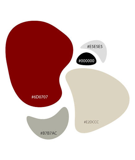
Color selection
The color palette selected for Sofia Seidel (wine red, cream, light green, and black) were carefully chosen to reflect the elegance, warmth, and sophistication of her culinary brand. Wine red evokes passion, depth, and the richness of carefully crafted flavors, creating an immediate sense of refinement. Cream brings warmth and approachability, balancing the intensity of the red while suggesting the artisanal, handcrafted quality of her creations. Light green introduces a fresh, organic touch, symbolizing creativity, natural ingredients, and sustainability. Finally, black anchors the palette with timeless sophistication and versatility, reinforcing the premium, polished aesthetic of the brand. Together, these colors harmonize to communicate both the artistry and the intimate, elevated experience that defines Sofia Seidel’s culinary identity.
