
Introduction
Kitchen and Manners is a culinary brand that focuses on promoting creative cooking and thoughtful dining experiences. However, its previous digital presence lacked visual consistency, accessibility, and a clear structure, which made it difficult for users to navigate and connect with the brand’s essence. The interface suffered from poor hierarchy, limited contrast, and a layout that did not adapt well to different devices, resulting in a fragmented user experience.
This redesign project emerged from the need to create a more intuitive, inclusive, and cohesive platform: one that could communicate the brand’s warmth and sophistication while ensuring better usability and visual harmony.
Softwares

Problematic
The main challenge with Kitchen and Manners was the lack of accessibility and adaptability across devices. The website was not optimized for mobile use, had repeated pages, and presented a visual design that made reading and navigation difficult. As a result, the platform experienced a high bounce rate, with very few new users engaging with the site. Most of the traffic came from returning visitors or existing students of the cooking school, indicating that the website was not attracting or retaining new audiences.
My Role
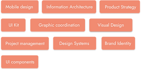
I was responsible for defining the visual guidelines of the application, ensuring a cohesive and engaging design. My key contributions included:
-
Creating usability components and a structured design system.
-
Establishing the color hierarchy to enhance visual clarity and appeal.
-
Maintaining close collaboration with the client to ensure their vision was met.
-
Working closely with the development team to integrate design seamlessly into the app.
-
I was involved in and organized several strategic meetings with the client to analyze the website’s informational content, copywriting, and SEO.
My role focused on balancing aesthetics, usability, and functionality to deliver an intuitive and visually compelling experience.
Objective
The main goal of the redesign was to transform Kitchen and Manners into a more user-friendly and visually consistent platform that could effectively communicate the brand’s identity. The project aimed to improve the website’s accessibility, readability, and responsiveness across all devices.
Solution
The redesign of Kitchen and Manners focused on creating a clear, accessible, and visually engaging platform that better represents the brand’s personality and values. The new design structure was built around simplicity and functionality, allowing users to navigate easily and enjoy a consistent experience across all devices.
Design Thinking
To address the challenges faced by Kitchen and Manners, the redesign followed the Design Thinking methodology, allowing for a human-centered approach that prioritized user needs, business goals, and aesthetic coherence.
Empathize
The process began with understanding the users :
both current students and potential new visitors. Through interviews and informal feedback, we identified their main frustrations: difficulty finding course information, poor mobile usability, and lack of visual consistency. This stage helped define clear user pain points and expectations for a better experience.
Define
Based on the insights gathered, the core problem was defined as:
“Users are unable to easily access information or feel engaged with the brand due to poor accessibility, disorganized content, and limited mobile adaptation.”
specific goals were set — to create a cohesive, responsive, and visually appealing platform that simplifies navigation and encourages new user engagement.
Design System


Conclusion
The redesign of Kitchen and Manners successfully transformed the brand’s digital presence into a more coherent, accessible, and visually engaging experience. By applying user-centered design principles, the project not only solved the site’s previous usability issues but also strengthened the brand’s identity and communication.
The new website offers a clean and organized layout that improves information flow and readability. Its responsive design ensures smooth navigation across all devices, providing users with a consistent and intuitive experience whether on desktop or mobile. The visual system—based on warm tones, balanced typography, and generous spacing—reflects the brand’s essence: creativity, warmth, and sophistication in the culinary world.
From an analytical perspective, the redesign achieved measurable improvements:
-
Reduced bounce rate, as users now interact longer with the site.
-
Higher engagement from new visitors thanks to clearer calls to action and improved accessibility.
-
Stronger brand perception, positioning Kitchen and Manners as a modern, professional, and approachable brand.